27 July 2011

First Report: Wizarding Event


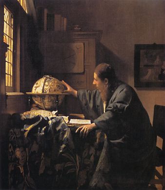
Still photo of me in my Portrait Wizard Character role.
(The 15-minute looped video ran continuously through the day.)

This past Saturday saw the successful production of the Wizarding Event.  Up to an hour before the arrival of the "New Students" the cast and crew were still hurrying about, setting up the classroom sets, the Great Dining Hall, and making sure the electronics for the three moving portraits (one for a live actor) were working.

At the last moment I was asked to fill in for the lunchtime postal carrier, so in addition to arriving for the end-of-day party in my character as the editor of the newspaper the students monthly over the last 5 months (and which I'd mostly authored), I invented a Pony Express Carrier persona. An observant student would have noticed that a single actor was playing three roles (including the portrait wizard above).  But to my amazement, they never realized! It was very hard not to break character and laugh the third time I showed up. 


In my Editor role, with my brother Architect as the Headmaster.

Dear Readers, I am not a person easily missed.  I am several inches over 6 feet tall!  Yet via the wonders of 3 different wigs in 3 different colors; 2 different styles of glasses; 3 very different costumes; 3 different sets of body language and, in the case of the Pony Express and Editor personas, 2 very different speech cadences and accents, no one appeared to be the wiser.

I wasn't present for the main portion of the event, so I will need to post pics of the classes and other activities later when I get them from our photographers (who played reporters for the local wizarding newspaper!).  But here are some that I shot before and during the final party.

One major set was the combined store and post office.  Here is the schematic I made during the collaborative design phase.


Architect created the Trolley using a 1970s-era neonatal mobile intensive care isolette (a self-contained incubator unit) as its base.  A table already present in the hallway of the venue building served as the Owl Post Office.  A CD cabinet provided the P.O.'s "cubbies" and served as the sale area for the sheets of postage stamps, aerograms, brochures, and freebie stamp boxes.  The postcard cabinet made from a rummage sale recipes box/shelf held a display of 7 different postcards designed for the event. 


The Owl Post Typewriter, which we'd thought would work sitting on the Trolley's pull-out counter, wound up on the table - making it more accessible for the mostly small-sized students.  And the chalkboard was hung on a conveniently present nail, opposite from the planned location. (We were not allowed to pound in nails to hang things, which proved to be a bit of a challenge.)


Post Office side of the set.


Trolley Cart/Store set located next to the Owl Post Office
(with the P.O. mail dropbox on a slide-out counter). 

The Trolley proved to be a major attraction for the kids.  Though a little difficult to see in the above pic, there were numerous large jars of candy, school pennants, glow-bracelets, bags of hard candy, and other knick-knacks. A big hit were the chocolate frogs made for us by a local chocolate maker. (We thanked her by including her - in costume - as one of the wizards on the the "trading cards" that came with the frogs. Below, as an example, is the card for my Portrait Wizard Character.)


Students were required to bring $10 - which we converted into the wizardly currency of the day (actually a combination of oddly sized foreign coins). 


Receipts were provided for each purchase using an old,
hand-operated machine with receipts designed with Photoshop.


Trolley Cart/Store (and very eager students!)

Another key set was the Headmaster's Office.  The building venue was an early 20th-century Craftsman-Style mansion very kindly donated for the day's event.  A study-like room off the original living room was decorated to reflect the Headmaster's eclectic interests. 


It even had a fireplace!  But to keep students from playfully trying to use the "Floo Network" described in Rowling's books, a whimsical Out-of-Order sign was posted (and on all the fireplaces on the two floors we were using).


Here are a few miscellaneous images I was able to catch later in the day.


One of the outside classrooms.


The "Grand Dining Hall" with its House Banners and large floral centerpiece.


The Headmaster instructing one of the students on the use of the "spell crystal" and tuning fork she'd received in her Owl Post package.


The Headmaster describing an imminent class field trip to Egypt via the PortKey created by students earlier (in a class taught by a local art welder).

As I receive more pics from our media crew, I will post them here.  In the meantime, In the coming few weeks I will also report on the props and postal items I created for the day.

24 July 2011

Urban Farming: Week 9


Dear Diary,

It's just as well the house nickname for our little garden plot is a science experiment!  Some things are growing well, others not so well, and still others. . . who knows? 

One of the zucchini plants appears to have offered its life for the sake of zucchinis everywhere.  I'd missed a few days watering due to my uber-focus on the Summer Wizarding Event.  All the other plants bore it well, but this one did not.  And three of the squares are just blank!  Not sure what the story is there; will need to scrounge up the original planting map and the back up seed packets.  Maybe I can get another round of something in for the latter half of the summer.


The pole beans are busy making Plant Art.  Their topmost tendrils are making lovely curlicues around the trellis we put there for them.  I pulled one carrot to see how far they have to go . . . pretty far.  The bush beans are finally starting to reveal actual beans!  Not just all that leaf-i-tude.

And we harvested the leaf lettuce this morning.  With the temps here in the very humid 90s, we are eating light.  The lettuce will make a perfect lunch.


The sunflowers are about 3.5 feet high now.  No seed-heads yet, but I think we'll be ok.  The sunflowers planted a few weeks earlier in the community section of the gardens are almost 1.5 feet taller, but have no heads yet either.


20 July 2011

Real Postage This Time


This past April, I posted on the making of faux postage stamps.  Though not a collector, I am just as keen on real postage.  I've been using them on the letters packets and packages our new "students" will receive at this weekend's Summer Wizarding Event.


One of the "Faux Packages"
Photo by me

So I keep my eye out for sites with images of real postage.  I have a bookmarked file of them.  I use them for reference and my mail art projects. And I never pass up the opportunity to buy a packet of old stamps at a yard sale!  I have a great stash for projects.  Here are some of the sites I've marked.

Image from How to be a Retronaut

The endlessly absorbing site by Oxfordshire's Chris Wild -- a consultant in archives, museums, brands and digital history-- is How to be a Retronaut He had a post on postage stamps about communication. Here's that link.


Images from Adapt_or_Die's Flickr stream

Flickr has been a good resource for my stamp hunts.  A member going by the name of Adapt_or_Die has a collection of 20th-century postage stamp  images that are strong in terms of their color and graphic sensibility. His/Her collection is here.


Philatelic reference sites, i.e., websites about by by stamp collectors, are a rich resource for stamps as well as images of old letters and postcards. The image above comes from a site that includes an entire section on St. Vincent, a British territory in the Caribbean.  Go here to see the wonderful selection of images.


Image from The Fortean Times

In an undated article from The Fortean Times, an online magazine dedicated to "the world of strange phenomena", I found a great collection of stamp images illustrating themes of UFOs, SciFI, and space travel.  The link to that article is here.


The above image comes from a Tumblr collection of vintage postage stamps curated by Karen Horton.  In addition to images of stamps, she includes the occasional pic of various items decorated with stamps such as envelopes, miniatures, a bingo card.  You can see her 24 pages of images here.


Image from t_delger's Flickr stream

Along similar lines is a group of Airline Stickers on a Flickr collection by t_delger. Here the link to that. They would make great faux postage stamps.


Once the theater project comes to its successful conclusion, I am thinking about doing some real postage designs of my own. Zazzle lets you do that (see above images).  Here's the link.  (I'll post the link to mine when they come to fruition!)


16 July 2011

A Feather To Write


The Summer Wizarding Event is fast approaching. Our crew of Makers is rushing to finish up their respective tasks. One of mine has been the creation of the "quill pens" that our new wizarding students will be using on the day.

I found some feathers at JoAnn Fabrics; turkey feathers of many sizes that had been dyed a variety of wonderfully bright colors.  And my local Walgreens had the el-cheapo style of ballpoint pens I needed for the ink supply.


The procedure for making the feathered pens was pretty straightforward.  I first examined all the feathers and selected ones both that had a wide-ish shaft all the way to the point and a hollow space in the shaft that was at least 2.5 inches in depth, preferably three.  Then I did the following.
  • Step 1: Clipped the end of of the feather point to open the shaft.
  • Step 2: Used a narrow knitting needle to gently clear the keratin material from the inner shaft.
  • Step 3: Using a basic household pliers, removed the ink column from the pens.


  • Step 4:  Measured how deeply the inkpen column would fit into the feather's shaft; cut the inkpen column to that length.
  • Step 5: Insert the pen column into the shaft, using a tad of super glue at just before the pen point (so that the pen column would stay put in the shaft when in use.

Here's how the pens looked at this point:


Besides looking a little incomplete, the pen shafts tended to want to snap off in use (it took me two mistakes to realize this!). I spoke with my brother, Woodcrafter, after hearing that some 10 years ago he had done something similar for a wizarding party he, his wife, and friends did for their children.  He told me that the pen shafts needed extra support.  Great minds think alike: I told him of my plan to wrap the shafts with cord.  He did that too!  I also added a thin piece of felt around each shaft to provide a cushioning effect.

Here are the finished feather pens. It's a little difficult to see in these pics, but the cord I used for wrapping was a dark gold color that had a second, metallic thread woven throughout.  So the shafts of the pens sort of glitter.


14 July 2011

Photo Contest: For UK Post Office Devotees


Given my blatant proselytizing for all this postage and letter-writing related, I would be remiss not to give this heads up to my readers in the UK about this photo contest being hosted by the folks of The British Postal Museum & Archive.  Here's "da skinny" (as we Yanks like to say). Good luck!


"The British Postal Museum & Archive is offering amateur photographers the chance to win a superb camera, as well as the opportunity to be a part of the BPMA's upcoming photography exhibition The Post Offices in Pictures.

The theme for the competition is 'the Post Office in the UK'. Entrants are invited to submit an image that illustrates the theme, inspires the viewer, and evokes curiosity to find out more about what is pictured in the photo.

Finalists in each of the two categories (under and over 16 years old) will be displayed on the BPMA website, in selected media outlets, and during The Post Office in Pictures photo exhibition.

A panel of judges will select a Winner in both categories, who will receive:
Under-16 Winner: a Nikon Coolpix P500 camera *
Over-16 Winner: a Nikon D3100 camera *

For full details of the competition, including guidance on eligibility and instructions for submission of entries, please read the Terms and Conditions. The closing date for entries is 5pm on 9 September 2011."

12 July 2011

One Cap, Two Cap, Gold Cap, Blue Cap


A couple of posts ago I reported on the fancy gold cap I was working on for a character in this Summer's Wizarding Event.* It turned out nicely, but was too small for the actor. So I trucked out to the local Goodwill stores to find some 'new' old drapery fabric to try again.  Other than an old blue dress which I could use as the lining fabric for one of the caps, I didn't have much luck. Fortunately, a local fabric shop was having their big summer sale and I was able to get some rather fancy stuff for the new gold cap as well as the "informal day cap" the character will be wearing when indoors.


Gold fabric pieces, braided piping, tassel, and pattern.


Blue fabric pieces (including checked lining), piping,
and faux eagle feathers for accent.

Before tackling the new versions, though, I redrew the pattern by tracing the commerical one and then altering the shapes a bit according to the feedback I got from the actor when he'd tried on the first version. 


And I made a test version of it using stuff I'd scrounged from the house rag basket and my stash of small fabric pieces (from earlier projects - too large to toss out).  I found a piece of a green cotton bedspread that was similar to the gold stuff in how soft and drapey it was; and a piece of upholstery material that was a little more stiff for the brim tryout.  The result was pretty fine, though I over compenstated and made it too large this time!


A Skype call with the actor came next.  My head is close to his size, so I modeled the cap and we talked about its shape and fit.  He like the beret-like floppiness and asked if the u-shaped opening in the front could be narrowed just a bit.  And as a nice outcome, we now have another hat for someone else to wear on the day!

I was nervous, though, when I began work on the final caps.  I have a kind of visual glitch, visual dyslexia I call it, where I find it very difficult to see how pattern shapes go together.  I know what is supposed to happen, but somehow I cannot translate that knowing to my hands when I do the actual work!

So I worked slowly - and fortunately had only one askew-error: I put the band on backwards so that the more shiny, and softer lining fabric is showing instead of the more elegant, slubby-textured upholstery gold.  The lining material is a little brighter, though, and actually looks ok.  Then I found a vintage, dark gold, metal button in my stash and used it to attach the tassel.


The final cap was all in blues to complement the blue, seersucker frockcoat that the actor is planning to sew himself for a sort of a Mark Twain-ish summer casual look. 


The cap fabric is elegant, given the status of his role as Headmaster, but a bit artsy as well.  The material was a little less stretchy than the gold stuff, though, which I didn't quite grok as I was working, so this cap will need to be worn a little higher on his head.


*  The Summer Wizarding Event is scheduled for late July.
Related Posts Plugin for WordPress, Blogger...