Showing posts with label stationery. Show all posts

04 May 2012

Fictional Correspondences: Making Your Own Letterhead - Part 2: Implementation


In the last post we looked at the design decisions for making this letterhead.  In this one, I'll show the steps I took to actually make it.*  Above is what the 8.5 x 11 inch page looks like.  The letterhead design close up looks like this.  


I used Microsoft Word 2010.  In this tutorial, I am assuming you have some basic familiarity with Word.


STEP 1:   ASSEMBLING THE IMAGES

I used only 3 images for this project.  The typewriter was a free download from a site called Liam's Pictures from Old Books.  The clip art image was black and came in several sizes.


The background and side scrollwork patterns were both from Microsoft.  


I retrieved them this way.

Under the INSERT label on the taskbar, there are two options for inserting a graphic: Picture - which lets you grab a file from your computer or a memory device; and Clip Art - which opens a side search box.


 Here's what the Taskbar options look like.


And here is what the side search box looks like.  You can see that I typed in the word "scrollwork" as my search term.  I looked through the results and found images I liked.  I've highlighted them here. Clicking on them transfers them on to your document page.

Clicking on the image itself brings up the Picture Tools taskbar. I used that a lot for this letterhead design.  I've included a screenshot of that below.  The image is rather small for how much info it contains, so I've include a few close up of the taskbar in sections.


 Entire taskbar


These options let me change the color of the image, change its level of contrast and brightness, jazz it up with "artistic effects", and remove the background.


These options let me frame the image with different styles, add a border, add some effects, and dink around with "layout."  I only used the "border" and "effects" functions for this project.


These options let me position the image on the page, set how tightly text will wrap around an image, layer it in front or behind, align, rotate, and set the image's size. To be able to move the image anywhere I wanted, I first had to set it via the "position" option.  It doesn't matter where you put it, but you need to put it somewhere in order for the image to be moveable after.  Other than that,  I used only the forward/backward functions.


 STEP 2:   MODIFYING THE IMAGES

I did three things to these images: changed their color (typewriter and smaller scroll images), add a "glow" effect to the typewriter, and make the larger scroll a pale background color.  Here's how I did that.

CHANGING COLOR
  • Click on the image you want to recolor.
  • Click on the Color icon.


Select the color you want OR select the More Variations for more color options.  I chose the brownish-black.


I then darkened the image by selecting the Corrections option, and choosing the slightly darker version from the options. (I did this and the following for both the typewriter and smaller scrollwork images.)


ADDING EFFECTS
Then I added a glow effect to the typewriter image alone by using that option from the task bar.  Because none of the default options were what I wanted, I had to use the More Glow Colors option.  I picked a dim brownish-grey shade.


CHANGING THE LARGE SCROLL IMAGE'S COLOR AND CONTRAST

Finally, I lightened the larger scrollwork image by using the Color icon again and selecting the lighter, grey shade. . .


. . . and then the Corrections option to lighten it just a bit.


STEP 3:  ARRANGING THE IMAGES

This last step was the easiest as it involved just positioning things.  First I made a copy of the large scrollwork image (Copy-Paste), turned one of them over, and arranged them close together.


Then I made the two images into a single, grouped image by using this function from the Picture Tools taskbar.


Then I (1) made a copy of this new grouped image, (2) and turned one upside down over the other, and (3) grouped the entire kit-n-caboodle into a final single image.


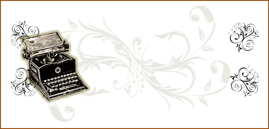
Then I completed the picture work by placing the typewriter image over this at the left and four copies of the smaller scrollwork image at each of the four corners of the design space.  (One uses the Bring Forward/Send Backward options to place images in front or in back of each other.)


Here's how the images alone looked.


STEP 4:  ADDING THE TEXT

I added two kinds of text to the letterhead: smaller, horizontal lines with the company's motto and a string of city locations.


For these, I just used the Insert Text Box feature, typed what I wanted there, and positioned the text boxes on top of things.  (I made sure to change the color off all these fonts to match the brownish-black color I'd used for the images.)


Creating the company name -- ACME Wizard Word Typewriter Co. -- used the Insert Text Box feature as well.  To make the letters wavy I used a feature we haven't seen here yet: Drawing Tools.  This taskbar opens when you click on a text box.  


Here is the entire Drawing Tools taskbar.  
And here are its components close up.


After creating the text box, using one of the decorative fonts
  • I clicked on the text box (bring up the Drawing Tools taskbar);
  • selected theText Effects feature; and then
  • selected the specific effect I wanted.
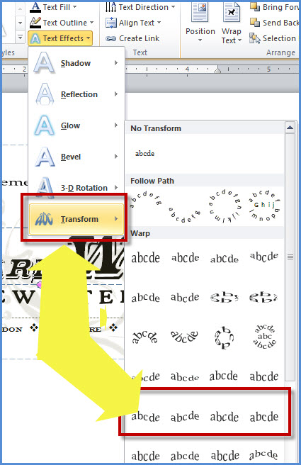


And because I was using different fonts for the three parts of the comany name, I did the above steps three times.  The finishing touch was putting a narrow, dashed line above the city locations. This was done by clicking on the Insert tab, selecting the Shapes feature, and then the line shape.


Voila! The letterhead was complete.  All in all - since I am somewhat familiar with the tools for graphics and text visual in Word - this took me about 1 hour to complete (once I'd decided what I wanted and located the images).

No doubt this could be done with other software (such as Adobe Photoshop) and perhaps with greater ease.  But I was asked how I did this, and here you have it.

* This is probably the longest post I have done and am likely to do!  Thanks for hanging in there.


Next in the series: Fictional Correspondences: Addressing Fictional Postcards for the NonFictional U.S. Mail (to be posted on 13 May).  >>> Future posts of the series will be posted intermittently as I've other fun things awaiting their time in the sun.

______________________________


Follow the series.
4. Fictional Correspondence: Making Your Own Letterhead - Part 1: Design 
5. Fictional Correspondences: Making Your Own Letterhead - Part 2: Implementation (this post)

30 April 2012

Fictional Correspondence: Making Your Own Letterhead - Part 1: Design

[UPDATE:  6 June 2012 -- This page posted in 2008 has a bunch of old letterhead designs that you might find useful: http://www.creativepro.com/blog/scanning-around-gene-dead-letterhead-department.]


A fictional correspondence can be greatly enhanced by the use of real-looking stationery.  One characteristic type of stationery is referred to as letterhead.  The good folks at Wikipedia define letterhead as "... the heading at the top of a sheet of letter paper (stationery). That heading usually consists of a name and an address, and a logo or corporate design, and sometimes a background pattern. The term "letterhead" is often used to refer to the whole sheet imprinted with such a heading."

As an owner of a small collection of old typewriters, I thought it would be fun to create a letterhead design that I could use when I send fictional letters to my friends (or their characters) from the 2011 summer wizarding event.

Here is what I created.


 And here is how I made it. 

Part 1: Design (this post) will show you the steps I took to decide what I wanted my letterhead to look like.  The next post (Part 2: Implementation) will show, step-by-step with screenshots, how I created my letterhead using Microsoft Word.

To begin then: the first step is design. I wanted my  letterhead to look old fashioned, so I went online to find examples to inspire my own design. I began by looking for historical models which I found by searching on Google Images.  As a sometime librarian, let me give you a hint about searching for stuff.  Search on too broad or general a word/phrase and you'll get hits/results that are similarly too broad or general. Going too detailed or specific often means fewer, less applicable results. Doing a good search is a matter of term/phrase balance and accuracy.

Figure 1 here shows what happens. Searching using the very general term letterhead got me lots (and lots!) images that looked like this: moderny, corporate stuff.

Figure 1:  Results of 1st search on Google Images


So I tried a slightly more specific search phrase: Vintage Letterhead.  Definitely better. I found some images that were closer to what I had in mind.  

Figure 2: Results of 2nd search on Google Images.


I could have stopped right here as there were lovely samples for me to work from.  The two closeups below show lovely, messy collections of images and fonts that call to mind an entirely different times and places.  Just the sort of thing I wanted for my wizardy-looking letters!


Out of curiosity, since I wanted to see some letterhead with typewriters in them, I searched on the most specific phrase typewriter letterhead.  The results were less successful in that I got a mix of actual letterhead and miscellaneous images of typewriters from, on, or near stationery.


Figure 3: Results of 3rd search on Google Images.


But that one image in the lower left caught my eye.  Here it is close up.


Version of same letterhead with the aged paper background removed.  

Looking at this one, along with some of the images from my second search, I began to get an idea of what I wanted.  Here are some of the characteristics I borrowed from the vintage-era letterhead models.


For me, design works in stages.  First I see something, then I think about it for awhile, and then I try putting in and taking out different things.  For that to work I need the "different things."  In this case, that meant a bunch of different fonts and some graphics/images.

The fonts were pretty easy.  Microsoft Word has a bunch built in.  Plus there are sites online that provide a wide variety for free or very inexpensively. 

One site is called DaFont.Com


I took the time to look at the numerous font choices.  Each category has quite an array.  Here, for instance, are 3 from the Decorative category that might work well on a vintage-look letterhead.


Under Dingbats - Ancient I found these fonts which could be used to provide background images in a letterhead design.


Since I wanted my letterhead to be for a fictional/wizardy typewriter company, my next step was to find an image of a typewriter, preferably an old machine.  Plus I wanted the image itself to look vintage in design.  Finally, I wanted to find an image that was either in the public domain or freely offered by its maker.


This last point in an important one if you plan on selling your work.  Respect for the work of another is ethical and, in some instances, legally necessary.*  Most of my letter art is private and of the fictional, one-off variety sent to a pen friend or fellow letter gamer.  Should I expand my work to sell, I will be sure I have permission for the images I use.

There are endless images and image sites out there.  Doing a search on Google Images using the search phrase typewriter clip art helped me locate what I wanted.


Figure 4: Some results from Google Images.


These two from the search come from sites I like to use: Clkr.com and ClipArt ETC.


Image from Clkr.com

[from their Terms of Use page] "Clker.com is an online sharing service where users share free public domain vector cliparts, or share public domain photos and derive vector cliparts from those photos using clker's online tracer."


 Image from Clipart ETC

[from their home page] "Welcome to quality educational clipart. Every item comes with a choice of image size and format as well as complete source information for proper citations in school projects. No advertisement-filled pages with pop-up windows or inappropriate links here. A friendly license allows teachers and students to use up to 50 educational clipart items in a single, non-commercial project without further permission."

The target audience of Clipart ETC are educators.  Right now I use only the occasional image for personal use. When I expand my work as I hope to, I will be contacting them to license images I want to use.


So, now I have a design concept worked out and have located some fonts and images that I think will work.  In the next post I'll show you how I put them all together to create the letterhead for my wizardy correspondents!

Next up in this series: Making Your Own Letterhead - Part 2: Implementation (to be posted on 4 May 2012).   


* The folks at Clipart ETC do a nice job of explaining what goes into providing their images.  I like it because it reminds us that someone did a heck of a lot of work to provide this material.  
[from their FAQ]  "Why do you have a copyright notice on really old illustrations?  It is true that the original drawings that many items in this collection are based on have long passed into the public domain. However, by the time we have scanned, cropped, cut out backgrounds, fixed broken lines, simplified, sharpened, and otherwise cleaned up the original drawing, the result is a new artwork derived from the earlier drawing. The derivative work is protected by copyright even though the original is in the public domain."
______________________________________

Follow the series.
4. Fictional Correspondence: Making Your Own Letterhead - Part 1: Design (this post)

Related Posts Plugin for WordPress, Blogger...