23 October 2011

Packages for an Imagined Event, Item 7

Brass containers and candlesticks

I come from a family of makers, inventors, artists . . . and inveterate scroungers!  We enjoy making things out of other things.  Often, given our number and above-average height, the scrounging was a necessity.  But it's also a heck of a lot of fun to see what can be created.

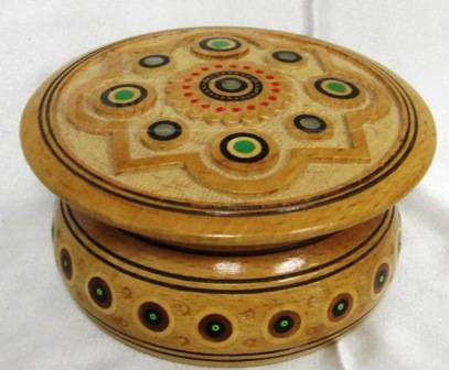
 Carved wooden trinket box.

So when I was asked (way back in January!) to participate in this Summer's Wizarding Event, I knew that visits to Goodwill and similar resale shops would play a large part.  One of my key roles was to create the set, contents, and faux mail for the post office (the "Owl Post" ostensibly had a branch location in the mail hall of our magical school). One of my goals was to create a "perfect package" for each of the 19 children who attended that day as "First Year Students".
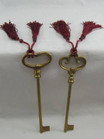
 Two old metal keys.
To be "perfect" each gift package had to fulfill the following goals:
  • The items contained had to be things that could be regarded (or imagined) as magical in some way.
  • The gift package had to suit the child's age (our group went from 8-14 years of age).
  • The package had to have comparable coolness as far as all the other (19 total) packages were concerned (so that no child felt somehow slighted).
  • Each package had to be slightly unique compared to the others (similar was ok, but the overall package had to be a one-and-only experience for the child).
  • Each package contained a personally written letter to the child that talked about the items enclosed.
  • The items had to be enclosed in some funky, exotic, or otherwise not quite everyday box of some kind.
  • The package had to be wrapped for the mail in heavy brown packing paper; tied with some kind of cord or fiber; addressed personally but oddly to each child; and decorated with real postage stamps and cancellation marks.

     Decorative Weaved Boxes, interiors.
    So every other week or so I trolled the Goodwill and resale shops in our area, eyes open and imagination turned towards any item (preferably $3 or less!) that could be transformed into a magical packet for a wide-eyed wizarding student. 


    Package 7 was almost entirely comprised of Goodwill items.The finished packet measured about 9 x 9 inches.


    A very cool part of this package was its box: a real wooden cigar box!  It has gold-colored hinges and clasp.  The outer edges were rounded off, giving it a kind of Art Deco appearance.  It didn't smell of tobacco, fortunately, but there was a painted on logo on the top.  I painted over it with green, metallic acrylic paint and then stamped and embossed a gold sun-shape over the green.


    There were 3 items in this gift: two brass-looking "mini-cauldrons" and a very old padlock with key.  Apologies: I forgot to photograph the lock!  It wasn't as old or as fancy as this antique French lock, but it had similarly raised markings.  The key wasn't a skeleton key as depicted here, but older than most of the keys kids would be likely to see nowadays.


    The cauldrons fit perfectly.  The lock and its key I enclosed in a "pillow box" that I had in my stash of stationery papers and envelopes.


    The letter for this item was handwritten on handmade paper.  I used my trusty Esterbrook "Dip-Less" Pen and vintage-era Esterbrook 407 Inkwell.  (Artist and author James Gurney had some brief, descriptive words to say about these two writing tools on his blog a couple of years ago.)


    What is especially cool about the pen is that it uses interchangeable nibs.  One pen, many possible ink lines!  (Finding the nibs is a challenge, though.  I lucked out the summer I found my pen and inkwell; both from eBay.  The prices on this stuff can be pretty outrageous.  Just now, while creating this post, I checked to see what was selling today.  One seller had the 407 inkwell starting at $16.00; another was offering a not-too-clean version at $189.00! Buyer beware indeed!)


    The surface of the paper for the letter was quite rough with bits of grass strewn in among the fibers layers.  I used the nib with the widest point and wrote rather slowly.  Even then it took me awhile to write this fairly short note.

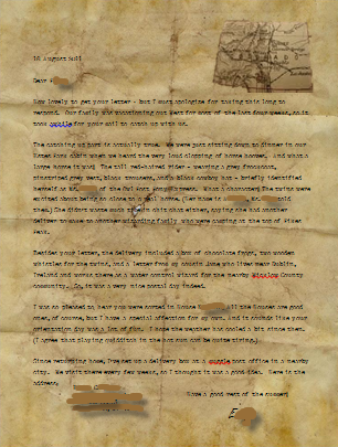
    Transcription of the letter:

    p.s.  Maybe you can use the lock?  Hope so.  J.F.

    Dear H----,

    I had these 2 mini-sized cauldrons -- now that I have a new one from my Dad I thought I would pass these on to a new student.  Good luck in Potions Class. Hope you do better than I did!  Ha Ha!

    Sincerely,

    J------- F----
    2nd Year
    House T----

    Like all the packages, the letter was folded and placed inside its box on top of the gift items.


    This packet was one of the largest given out that day.  Needless to say, when my Pony Express Carrier self brought this out of the large canvas delivery bag, all eyes were on it as the children wondered to whom it was addressed!

    * * * * * * * * * * *

    The posts describing these imaginary postal packages can be found grouped here under the tag faux package

    19 October 2011

    An Artist on Art Making


     Artist James Gurney (and friend)
    Story of this pic is on his blog here.

    Early in 2011 I "hearted" artist James Gurney, painter in the Realist style and author/illustrator of the much beloved Dinotopia books.  I referred to him then as Mr. Whimsy because of his delightful sense of humor and truly childlike joy.  But Mr. Gurney is a serious artist and, fortunately for us, a darn good teacher about what he does.

    "Bilgewater"
    by James Gurney, in his book Journey to Chandara

    "Journal"
    by James Gurney, in his book Journey to Chandara

    These past few weeks he's had a series of posts on his blog about his one-time work as an illustrator for the movie studio of Ralph Bakshi Productions. Here's the link the to last one which includes the link to the others in the series. This is really splendid stuff. 

     A younger Gurney (left) at work on a background painting.

    He talks about the process of making, the camaraderie and often wild antics of his studio mates, and the sense of film making history.  As I said, splendid stuff - read it!

    Links to Mr. Gurney's various sites:

    His artist website
    His blog
    The Dinotopia website


    15 October 2011

    Charting the SciFi Readers

    Image from NPR's post.
    The link to the larger image is at this same site.

    The folks at National Public Radio have contributed a bit of graphic awesomeness to the visual universe: a flowchart of the top 100 scifi books ever written (According to their own survey, of course; you may disagree).

    Here's what they said: "Over the summer, NPR solicted the input of its listeners to rank the top science fiction and fantasy books of all time. Over 60,000 people voted for the top picks which were then compiled into a list by their panel of experts. The result? This list of 100 books with a wide range of styles, little context, and absolutely no pithy commentary to help readers actually choose something to read from it."


    Of course I had to see if my all time fave -- Ursula K. Le Guin's The Dispossessed was there. It was, but as a bit of an outlier; it's only label being "communisim."  It certainly addresses that, but there is a heck of a lot more to it and the author than something that simplistic.  Other tags for it might be: utopianism, dystopia, sustainability, anarchism, world building, physics in fiction . . .

    Makes me wonder what books and what labels the NPR list would have if it had been a survey of world readers, not just U.S. (Stanislaw Lem doesn't even make the list!!)


    11 October 2011

    VIDEOS: Shakespeare is Funneth


    Listen to enough Shakespeare and you start talking all forsoothy and forthwithy! It's wonderful, I do declare and command it be so.

    Enjoyeth!


    07 October 2011

    Packages for an Imagined Event: Item 6

    [further info at the end of this post *]

    One especially fun aspect of creating the gift packages for this Summer's Wizarding Event attendees was imagining where some of the items in the packets came from.  Each gift has its criteria (as mentioned in the Package 1 post) but there was a kind of individualized application of the guidelines.  The things chosen for each package created their own story. In this case, the container for the items lent to the tale as well.


    This packet began with its box - a most unusual box.  Triangular in shape (about 7 x 7 x 4 inches) with rounded corners and an embedded magnet to hold it closed.  It was painted and  decoupaged by my late sister, Artist, who took a great deal of delight in creating whimsical things.  This box was part of her creative legacy.  I thought it right proper that it become part of a whimsical gift.


    The box struck me as something a traveler might carry.  So I looked through the many items of the great stash of unusual things I'd amassed for this postal project.  A sea urchin caught my eye immediately.  And it fit perfectly in the box.  I continued on: picking up something and placing it the box along with the sea urchin then looking at it awhile to see if it "fit" the as yet unwritten letter and story that would accompany the box.  Eventually, in increments of adding and subtracting, the box's contents came together.


    a sea urchin
    prayer beads
    (faux) silver magnifying glass
    2 brass bookmarks
    a small envelope of (faux) postage stamps

    The letter for this package turned out to be short and not too detailed.  The collection of items were so evocative and their box so distinctively personal that I did not want to overplay the effect.  So I wrote simply, and -- using one of my portable typewriters (a Smith Corona Galaxie) -- typed it up on faded green paper.


    Text of the letter:
    Dear P----,

    I graduated from N----- so long ago that I hardly remember!  But I always like to send a little gift to a First Year Student - just to remind myself how fun my 1st days of school were.  The enclosed I picked up on my various travl travels.  The shell was a gift from a Sea Wizard.  She said she used it as a spellcatcher.  The bookmarks I am sure will come in handy too.

    Cordially,

    I------- C. B----

    [handwritten on the left]:  My House was House D---------! Which gives you an idea of how long I mean!

    NOTE:  In our version of a School of Magic, House names occasionally changed (except for that of the first, founding House).  So for this lady to say her House had a different name indicates she was a student probably in the late 19th or early 20th century.

    The folded letter was placed on top of the boxed items.


    Wrapping the package for posting was only a small challenge.  I used raffia (the same that I used making the Headmaster's straw wizard hat!) to tie it up.  The vintage postage stamps were from France and, I think, China.  The cancellation stamp was from my collection of postal-related rubber stamps, and indicated the package had been sent from Paris.  The Parcel Post stickers were a lucky find from a nearby office supply/typewriter repair shop in my town.  Along one wall they sell "old timey" stationery, stamps, and stickers. (In reality, I suspect this is stock from their own mid-20th-century inventory that never sold!)"


    There is a delightful sequel to this packet as well.  Several weeks after the event, I heard from the actor who played our Headmaster.  It seemed his character received a letter from this student!  Only the letter was addressed to one of the imaginary characters who had authored one of the letters she received during the noontime Owl Post delivery --not the one who had sent her the package.  The actor kindly forwarded the letter to me (actual author of nearly all the letters).  

    It was a friendly note to the person, saying how much she had enjoyed her first day at the School of Magic, and made reference to the classes she took and that she hoped to someday meet the letter author's "twins" when they started their studies at the school.

    Well, I couldn't resist her charming note and wrote her a reply in the persona of the letter author.  I also amused myself by describing the Pony Express rider I played on Event Day, delivering all the packages and letters!  The letter was created using Microsoft Word.  I used an "old paper" graphic for the background (found via Google Images) and a typewriter font called Remington Noiseless -- available free compliments of typewriter guru and aficionado Richard Polt at this linkMr. Polt's typewriter website is here.


    Text of the letter:
    18 August 2011

    Dear P----,

    How lovely to get your letter ~ but I must apologize for taking this long to respond.  Our family was vacationing out West for most of the last four weeks, so it took awhile for your mail to catch up with us.
    The catching up part is actually true.  We were just sitting down to dinner in our Estes Park cabin when we heard the very loud clopping of horse hooves.  And what a large horse it was!  The tall red-haired rider – wearing a grey frock coat, pinstriped grey vest, black trousers, and a black cowboy hat – briefly identified herself as Ms. K--- of the Owl Post Pony Express.  What a character! The twins were excited about being so close to a real horse. (Her name is A-----, Ms. K--- told them.) She didn’t waste much time in chit chat either, saying she had another delivery to make to another wizarding family who were camping at the top of Pikes Peak.
    Besides your letter, the delivery included a box of chocolate frogs, two wooden whistles for the twins, and a letter from my cousin Jane who lives near Dublin, Ireland and works there as a water control wizard for the nearby Wicklow County community.  So, it was a very nice postal day indeed.
    I was so pleased to hear you were sorted in House N-----! All the Houses are good ones, of course, but I have a special affection for my own. And it sounds like your orientation day was a lot of fun.  I hope the weather has cooled a bit since then.  (I agree that playing quidditch in the hot sun can be quite tiring.)

    Have a good rest of the summer!

                                    E---

    The posts describing all the imaginary postal packages can be found grouped here under the tag faux package.  


    ~~~~~~~~~~~~~~~~~~~~~~~~~~~~~~~~~~~~~~~~~~~~~~~~

    * Info on this image: "from http://www.flickr.com/photos/jurvetson/751085804/ Author: Steve Jurvetson.  fat sea urchin "The little sea urchin on top is quite unusual. It was discovered by a research vessel near New Caledonia at a depth of 1000 ft." [from http://en.wikipedia.org/wiki/File:Sea_urchin_tests.jpg]


    03 October 2011

    Junk Box = Post Box


    One of the joys of this Summer's Wizarding Project was the creative challenge of making things on the cheap. Reuse, Repurpose, Recycle - we did it all!


    Trolling rummage and garage sales; checking out Goodwill, Salvation Army, and resale shops; picking up some cool looking thing that some one had put out for trash pickup - yeah, we did it all.

    And the neatest thing would happen -- something that our Main Making Crew often laughed about when we would get together -- how one's Imagination Eye totally shifted and could see how some cast off or piece of furniture or old dress or fabric or parts of something else could be transformed into some amazing prop or costume. (Brother Architect was a master at this! He actually "saw" an entire 7 foot set when he saw the 6 wooden pieces left over from a treadle sewing machine I'd dismantled some time back, some old glass bottle and lamp pieces, and a 1970's era end table.)


    As the Main Maker of the event's Post Office set and activities, I wanted us to have an unusual, but some how typical letterbox for our wizardy students and faculty to send their snail mail on event day.  I looked at all the letterbox images I'd found for this blog to see where my Imagination's Eye might go.

    I decided I wanted something made of wood but that's all I had at first.  So over the next few weeks I casually looked for some wooden thing that could be re-made into a letterbox.  

    I happened to be at a Goodwill one day and there it was!  The box!  I couldn't have asked for anything better.


    It was old and a bit beat up, made of plywood, and - best of all - had a hinged top with a metal clasp.  And it was priced under $10.  


    It was a nice size, too, about 12 x 12 x 6 inches.


    I wiped it down with a damp rag and scratched off the price sticker.  But that's all I did.  I wanted it to stay looking like something that had seen a lot of time and weather during its Owl Post service.


    Here's the schematic I made up to show the event Maker Crew.

    As with the Wizard's Typewriter, I traced the Owl Post logo I'd made onto its front.  But the paint job for this was a little more elaborate.  The typewriter cover logo was done in a single color.  For the postbox I did some layering.  Unfortunately, I forgot to take pics of the painting process, but here's what I did.

    (1)  Measured the diameter of the Owl Post logo and drew a circle that same size on the center front of the box.

    (2) I painted the circle a solid off-white color using some left over matte-finish, latex interior wall paint I had.  Let it dry for 24 hours. 

    (3) Traced the Owl Post logo onto the wood using transfer paper (similar to old fashioned carbon paper, but with a non-wax tracing surface. I bought a pack of 9x13 inch sheets in 4 colors plus a sheet of graphite paper at my local artist's supply shop.)  This (below) is not the brand I bought, but it is the same thing. Dick Blick carries it in all the colors and graphite.


    (3)  The logo was painted in using dark green acrylic paint.  I added a wide border as well.  I imagined that in an earlier time this postbox sat outside so the logo needed to be easy to see by passers-by.

    (4)  I aged the entire image by marking it randomly with several shades of brown and black drawing pastels which I then smudged thoroughly with my fingers. 


    The postbox before the mail slot had been cut in.

    (5)  Finally, to make it look properly used, I created a few cut marks along the surface with an awl. Once it looked right to my eye, I sealed the image with a matte-surface acrylic spray.  Later, another crew member marked off and sawed out the mail slot.

    I used the same cutting technique to age the logo on the Postmaster's Stamp Cabinet (below). 


    The color-aging, in this instance, was created by judicious use of "Antique Gold Rub-N-Buff." The ridges of the wood created a nice effect.

    Image from the Amazon product page.
    (I bought it locally, though, at a hobby shop.)


    The postbox (left) "in action" on the day of the event.


    Related Posts Plugin for WordPress, Blogger...